Example:
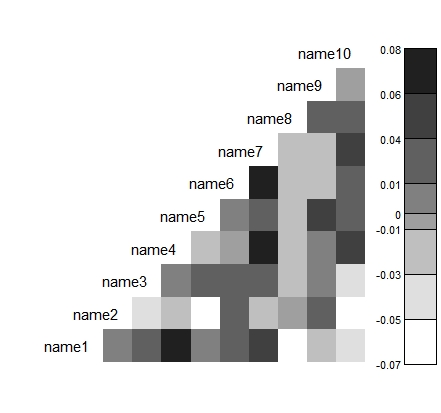
x1 <- rnorm(1000,50,2)
x2 <- rbinom(1000,1,prob=0.63)
x3 <- rpois(1000, 2)
x4 <- runif(1000,40,100)
x5 <- rnorm(1000,100,30)
x6 <- runif(1000,-10,-1)
x7 <- rpois(1000,10)
x8 <- rbinom(1000,1,prob=0.4)
x9 <- rbeta(1000,5,4)
x10 <- rbeta(1000,2,2)
test.data <- data.matrix(cbind(x1,x2,x3,x4,x5,x6,x7,x8,x9,x10))
test.names <- c("name1","name2","name3","name4","name5",
"name6","name7","name8","name9","name10")
corrplot(test.data,test.names,n.col.legend=7)


No comments:
Post a Comment