Showing posts with label Graphics. Show all posts

Tuesday, November 18, 2008

Plot symbols in R

In the plot environment, the "pch" parameter decides the symbol of your output. There are about 130 symbols hard coded and passed into "pch."


However, there are still some symbols that are not in these 130 pch's. For instance, there is no checkmark. To plot checkmark or other symbols, we can use symbol() in the expression() or quote() functions. For example:

plot(0, 0, main=bquote(symbol("\326")))

There are over 300 symbols that can be plotted using this way.

Wednesday, October 29, 2008

Plotting Math in R

Plotting math in R can be acheived using the expression(). To know detailed usage, in R console,

demo(plotmath)

But expression() is not flexible when you want to plot math symbols and parameters altogether. In this case, we use bquote() which is actually a wraper for substitute() and quote(). It has the ability to do paste() and expression() altogether. Here is a simple example.

k <- 2
plot(1, main=bquote(y[i][","][j]~"= "*.(k)))

Note, ".()" evaluates whatever inside the parenthesis. In the expression() and bquote(), "~"means a single-bye space. To bind two expression together without space, use "*" instead.

Tuesday, September 02, 2008

Top 5 downloads!!

Bruce forwarded this good news to us. All the articles of in the symposium he orgainized, which is about Excel 2007, are on the Top 25 downloads. It is my first journal article. This article evaluate the graphics engine of Excel 2007.

The purpose of default settings in a graphic tool is to make it easy to produce good graphics that accord with the principles of statistical graphics, e.g., Tufte, E.R., 1990. Envisioning Information. Graphics Press, Cheshire, Conn, Tufte, E.R., 1997. Visual Explanations: Images and Quantities, Evidence and Narrative, 2nd Edition. Graphics Press, Cheshire, Conn, Cleveland, W.S., 1993. Visualizing Data. Hobart Press, N.J Cleveland, W.S., 1994. The Elements of Graphing Data, rev. edition. AT&T Bell Laboratories, Murray Hill, N.J, Wainer, H., 1997. Visual revelations: Graphical tales of fate and deception from Napoleon to Ross Perot. Copernicus, New York, Spence, R., 2001. Information Visualization. ACM Press & AddisonWesley, New York, and Few, S., 2004. Show Me the Numbers. Analytic Press, Hillsdale, NJ]. If the defaults do not embody these principles, then the only way to produce good graphics is to be sufficiently familiar with the principles of statistical graphics. This paper shows that Excel graphics defaults do not embody the appropriate principles. Users who want to use Excel are advised to know the principles of good graphics well enough so that they can choose the appropriate options to override the defaults. Microsoft® should overhaul the Excel graphics engine so that its defaults embody the principles of statistical graphics and make it easy for non-experts to produce good graphs.


I am really excited to know about this!!

Sunday, August 05, 2007

Non-English Fonts in PostScript and PDF in R Graphics

Since R_2.3.0, R has released multilingual versions. If Users choose the option of "message translation" while installing R, they will get the R in chosen language. However, users need one more step to get their outputs that can show different language other than English correctly. To be sure, Paul Murrell and Brian Ripley has detailed documentation in R news about how to get this done!

Here is just a simple example of making a R graphic embedded with Chinese characters. For other language, please refer to the aforementioned documentation.

# R code
pdf("c:/Rtest.pdf", height=2, width=2, family="CNS1", version="1.3")
par(mar=c(1, 1 , 1, 1))
matplot(0:2, 0:2, type="n", axes=F, ylab="", xlab="")
box()
text(1, 1, "測試中文")
dev.off()


The crux is that you have do define a font family in your graphic command. For this example, the font family for Chinese is "CNS1." One caveat is that for some language, the version of PDF needed to be 1.3 or above, as shown in this example code.

Monday, April 30, 2007

Area Plot using polygon

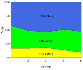
Area plot in Excel is handy in terms of plotting cumulative percentage variables. Here is the sample code using R to make areaplot. This is an example of Mexican party vote shares. The data was provided by Jeronimo.

Code for the areaplot funtion

areaplot <- function(x, axes=T,
xlab="", ylab="", main="",
density = NULL, angle = NULL,
border = NULL, col = NA,
lty = par("lty"),...){
# density, angel, border, col, are vectors.

# see polygon for the usage

max.x <- max(apply(x, 1, sum))
n.t <- dim(x)[1]
n.x <- dim(x)[2]

# creat empty plot first
matplot(0,0, type="n",
xlim=c(1,n.t), ylim=c(0,max.x),
xaxs="i", yaxs="i",
axes=axes, frame.plot=T,
xlab=xlab, ylab=ylab, main=main)

# organize data
x.star <- matrix(0, n.t, (n.x+1))
for (i in 1:n.x){
x.star[,(i+1)] <- x.star[,i] + x[,i]
polygon(c(1:n.t,n.t:1),
c(x.star[,(i+1)], x.star[,i][n.t:1]),
density = density[i], angle = angle[i],
border = border[i], col = col[i],
lty = par("lty"),...)
}
}

Example

# Sample data
PRD <- c(16.16, 16.38, 17.78, 13.5, 8.82)
PRI <- c(56.8, 48.2, 45.51, 50.48, 46.32)
PAN <- c(27.04, 35.42, 36.7, 36.01, 44.85)
dat <- cbind(PRD, PRI, PAN)

par(mar=c(3.5,3,0.5,0.5), mgp=c(2,.25,0), tcl=-0.2)
areaplot(dat, axes=F,
xlab="Vote", ylab="Income",
col=c("yellow", "green", "royalblue"))

# axes tuning to make graph prettier
axis(2, at=c(0, 25, 50, 75, 100),
labels=c("0%", "25%", "50%", "75%", "100%"),
las=2, cex.axis=0.7)
axis(1, cex.axis=0.8)
text(x=c(3,3,3), y=c(7,30,75),
labels=c("PRD Voters", "PRI Voters", "PAN Voters"),
font=2, cex=0.8)


Wednesday, March 28, 2007

What's wrong with pie charts?

Recently, I tried to shows the statistics of 6 major Official Direct Assistance (ODA) donor countries. My thinking was like this:

  1. No table! Make graphs.
  2. What do others commonly do? (pie charts!!)

In that very moment, I can picture that Andy shouts, "No!" What's wrong with pie charts? Here are what some experts would say.

Besides,

  • Dot plots are an excellent alternative to pie charts because they show data position along a common scale rather than rely on pie chart angles.
  • Dot plots can show more information (2 dimension, 3 dimension)
  • Just for kick, here is the pie chart that came in my mind in the very beginning.

Then I tried to do a dot chart, which is no better.


The data points convey 3 different informations.

  1. The relative position shows average(ODA/world ODA).
  2. The size of the circles shows a country's ODA/GDP.
  3. The numbers attached to the data points show actually amount of ODS in US dollars.
  4. The country names in the y-axis indicate the country names of the data points, sorted by a country's ODA/GDP.

This is definitely a junk chart. What's wrong?

  • Redundant informations! 3 actually does what 1 has already done. 4 does what 2 has already done in terms of showing a country's ODA/GDP.
  • The use of position for dots was distorted because of a nominal y-axis, multiple informations.
  • The x-scaling is too small, too detailed!
  • etc.....

After talking to Andy, Jennffer and Masanao, here is the revised one:

Now:

  • (x,y) position is more intuitively situated.
  • The circle sizes still mean ODA/GDP.
  • x-axis now has wider scaling (less details) and goes to 0 (Andy,"0 is meaningful here!").
  • ODA is the x-lab is still a problem. Normally, we don't use unconventional abbreviations in charts. It just doesn't communicate if readers don't know what they mean.

So here is what the caption of this figure:

Figure: Six major Official Direct Assistance (ODA) donor countries. The size of the data points indicates a countries ODA as a proportion to its GDP. The US gives the most ODA in the world in terms of the sheer amount. But it is only 1.4 percents of its GDP. Netherlands gives almost 9 percents of its GDP.

Thursday, August 31, 2006

[R graphics] Map


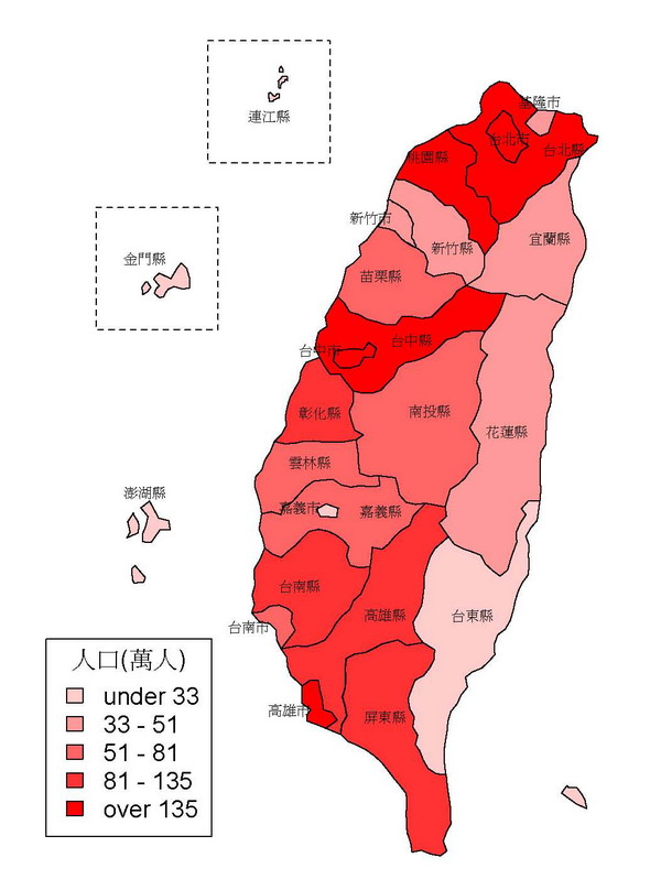
There are many things R can do, GIS maping is one of it. If you have the ESRI shape file ready, use maptools package to read the shape file into R. The R code is as follows.

# R code
library(maptools)
tw.map <- read.shape("taiwan.shp")
res <- plot(tw.map, auxvar=tw.map$att.data$POP06,
color="red", axes=F, xlab="", ylab="", pty="m")
str(res)
n.shp <- length(tw.map$Shapes)
x.pts <- tw.map$att.data$XLAB
y.pts <- tw.map$att.data$YLAB
legend(locator(1), legend=leglabs(round(res$breaks/10000,0)),
fill=res$ramp, bty="o", cex= 1.2, pt.lwd=3, title="人口(萬人)")
text(x=x.pts, y=y.pts, labels=tw.map$att.data$CNAME, cex=0.7)
rect(955, 1600, 1015, 1660, lty=2)
rect(1010, 1682, 1070, 1742, lty=2, xpd=T)
#rect(locator(1)$x,locator(1)$y,locator(1)$x,locator(1)$y)


Sunday, August 20, 2006

[R graphics] Correlation plot

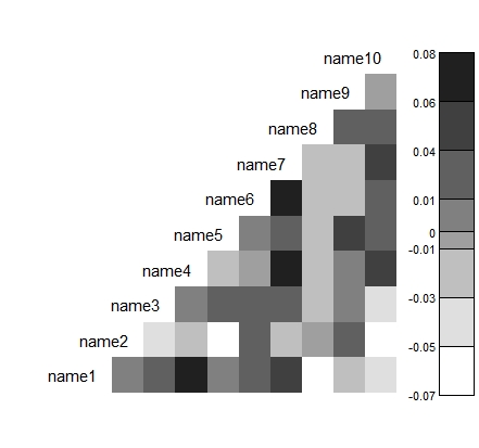
I have made a R function to make correlation plot like the one below. The R function is revised from the Figure 8 in Tian Zheng, Matthew Salganik, and Andrew Gelman, 2006, "How many people do you know in prison?": using overdispersion in count data to estimate social structure in networks". Journal of the American Statistical Association, Vol.101, N0. 474: p.409-23.

Example:

x1 <- rnorm(1000,50,2)
x2 <- rbinom(1000,1,prob=0.63)
x3 <- rpois(1000, 2)
x4 <- runif(1000,40,100)
x5 <- rnorm(1000,100,30)
x6 <- runif(1000,-10,-1)
x7 <- rpois(1000,10)
x8 <- rbinom(1000,1,prob=0.4)
x9 <- rbeta(1000,5,4)
x10 <- rbeta(1000,2,2)

test.data <- data.matrix(cbind(x1,x2,x3,x4,x5,x6,x7,x8,x9,x10))
test.names <- c("name1","name2","name3","name4","name5",

"name6","name7","name8","name9","name10")
corrplot(test.data,test.names,n.col.legend=7)

Monday, July 31, 2006

[R graphics]: Multimodal surface

The R graphic is replicated from Figure 1 in Gill, Jeff, and George Casella. 2004. "Dynamic Tempered Transitions for Exploring Multimodal Posterior Distributions ." 12 (4): 425-43.

The R Graphic:


The R code:

target <- function(x,y){
abs(
(x*sin(20*y - 90) - y*cos(20*x + 45))^3
* acos(sin(90*y + 42)*x)
+ (x*cos(10*y + 10) - y*sin(10*x + 15))^2
* acos(cos(10*x + 24)*y)
)
}


x <- seq(-1,1,length=120)
y <- seq(-1,1,length=120)
z <- outer(x,y,target)

par(mar=c(0.2,0.2,0.2,0.2))
persp(x, y, z, theta=65, phi=15, box=F)

The usage of persp.

persp(x, ...)

## Default S3 method:
persp(x = seq(0, 1, len = nrow(z)), y = seq(0, 1, len = ncol(z)),
z, xlim = range(x), ylim = range(y),
zlim = range(z, na.rm = TRUE),
xlab = NULL, ylab = NULL, zlab = NULL, main = NULL, sub = NULL,
theta = 0, phi = 15, r = sqrt(3), d = 1, scale = TRUE, expand = 1,
col = "white", border = NULL, ltheta = -135, lphi = 0, shade = NA,
box = TRUE, axes = TRUE, nticks = 5, ticktype = "simple", ...)

theta is vertical rotation, phi is horizontal rotation.